In the Anglo-Saxon, Norman and Medieval eras the main way of portraying Christian beliefs and stories was through imagery; most people couldn’t read and church services were held in Latin anyway. Ideas and beliefs were conveyed in wall paintings, stained glass, statues of wood and stone, carvings on the furniture, and on the walls and the exterior. Most of these images were whitewashed or destroyed in the Protestant Reformation. When English translations took over from Latin bibles and prayer books the beliefs could then be expressed through words that everyone could understand even if they couldn’t read.
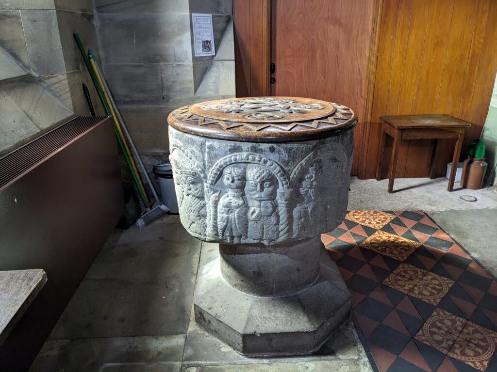
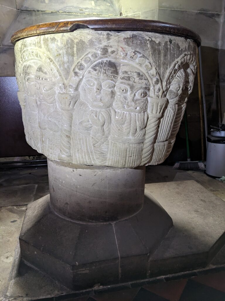
The one remaining item in the village from Norman times is the church baptismal font – the church itself has been completely rebuilt over the last 400 years. Standing just to the left of the door as you enter the church through the main door the font rests on a pedestal and has seven sides.
Like the rest of the church, the font would have been brightly coloured and shining a UV light on it now shows that the surface still contains traces of the pigments originally used. Light cream, red ochre, yellow ochre, green and black would have been the main colours. The protruding eyes on the carvings also suggest that coloured glass may have ben used for eyes.
Bill Wright wrote a few pages about the font in his book ‘Notes for a history of Armitage’ and, as a long-standing churchwarden, he was in an excellent position to thoroughly examine and measure the details – I have drawn heavily on his descriptions in this article.
Having seven sides is unusual for a font. Most of what are known as ‘Seven Sacrament’ fonts are confined to East Anglia and they portray each of the seven sacraments – baptism, confirmation, Mass, confession, marriage, ordination and the last rites – on one of the seven sides. The Armitage font is completely different.
The font is cut from grey sandstone and was made in the early to mid – 1100s. Like most rural church fonts it would have been the work of a local stonemason. It is roughly cylindrical and made from a badly cut block of stone. The existence of a churchyard cross, (even if it is a ‘copy’ of an older cross), suggests that it was near the place that a hermit preached (and hence the name Hermitage); the hermit may well have preached from a raised platform made of stone. There was a stone quarry at the edge of the current churchyard right next to the canal as shown on a map created for the digging of the canal. In the 1100s it was difficult to transport large blocks of stone and it is tempting to think that the font was made from stone quarried right next to the church. This perhaps also explains why the block was badly cut – it was the best that could be got from the nearby quarry. It has seven panels carved on it and each panel contains two human figures enclosed under semi-circular arches. The arches rest on pillars crowned with capitals. Each panel should be identically sized but because of the irregular overall dimensions they are not – for example, panel 1 is 1ft 6in high whilst panel 6 is 1ft 9½ in high. The figures depicted on the columns have distinctive prominent eyes. Most of the right side figures on each panel have moustaches.
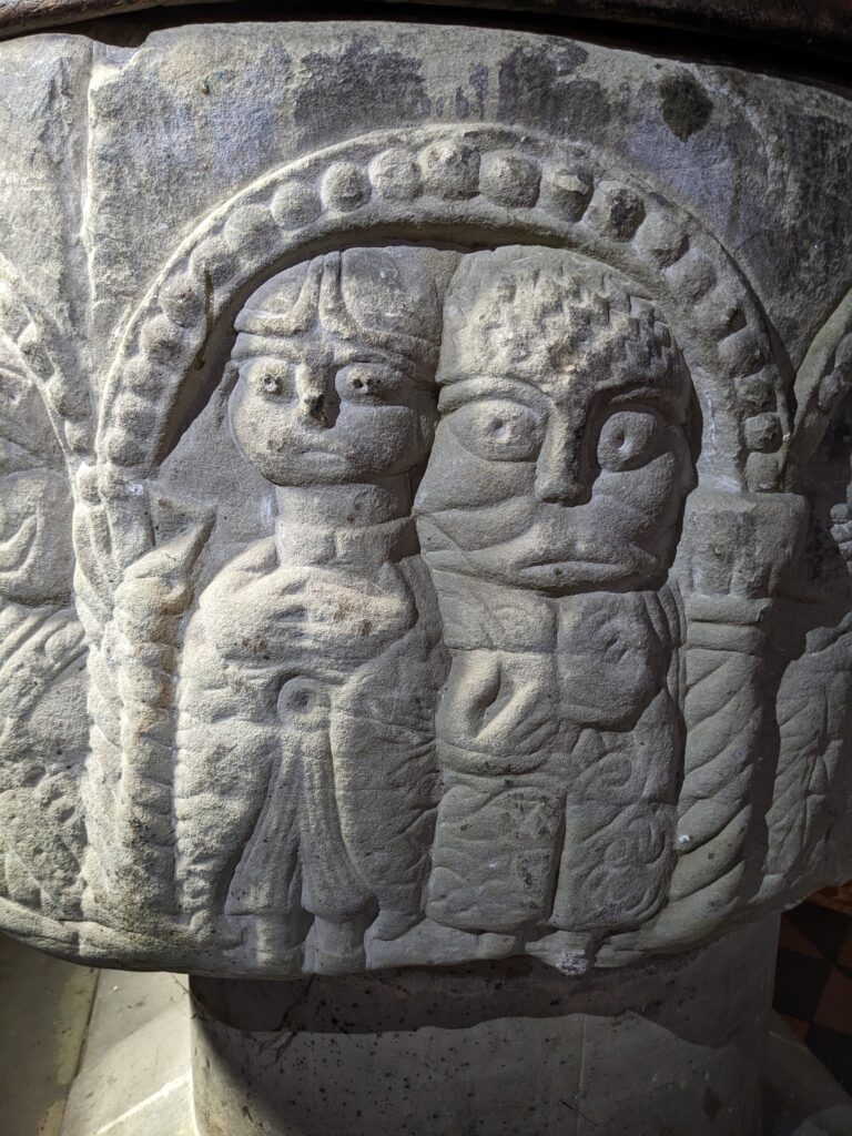
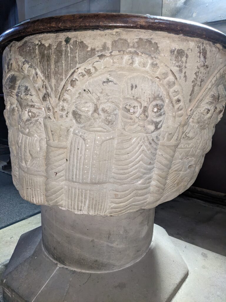
On panel 1 the first figure has a divided coat fastening around the neck and a clerical cap. He is wearing trousers that fasten below the knee and his out of proportion hands rest on his chest. The second figure has a gigantic head compared to both his body and the first figure. He is bareheaded and has a moustache. He has a quilted coat and holds a book in his right hand. This second figure is thought to represent an apostle.
Both figures on panel 2 have large heads and wear hats. The elaborate garments and head wear suggest these are bishops – this type of head wear was abandoned for the mitre in about 1175. This information gives a clear rough date for the font and indeed the establishment of the church.
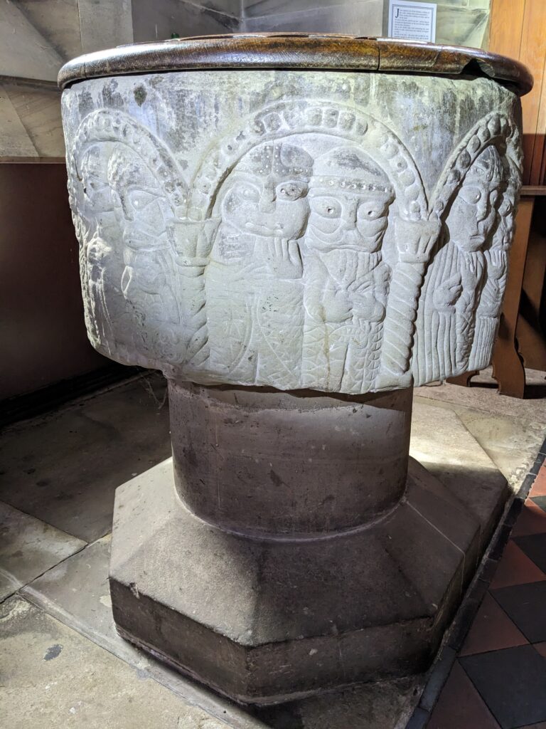
The figures on panel 3 have identical hats to those shown on panel 2 showing that they are also connected to the church but have less elaborate garments denoting a lower-level figure in the church.
The figures on panel 4 are both bare headed and more crudely carved than the other panels. They are thought to represent prophets.
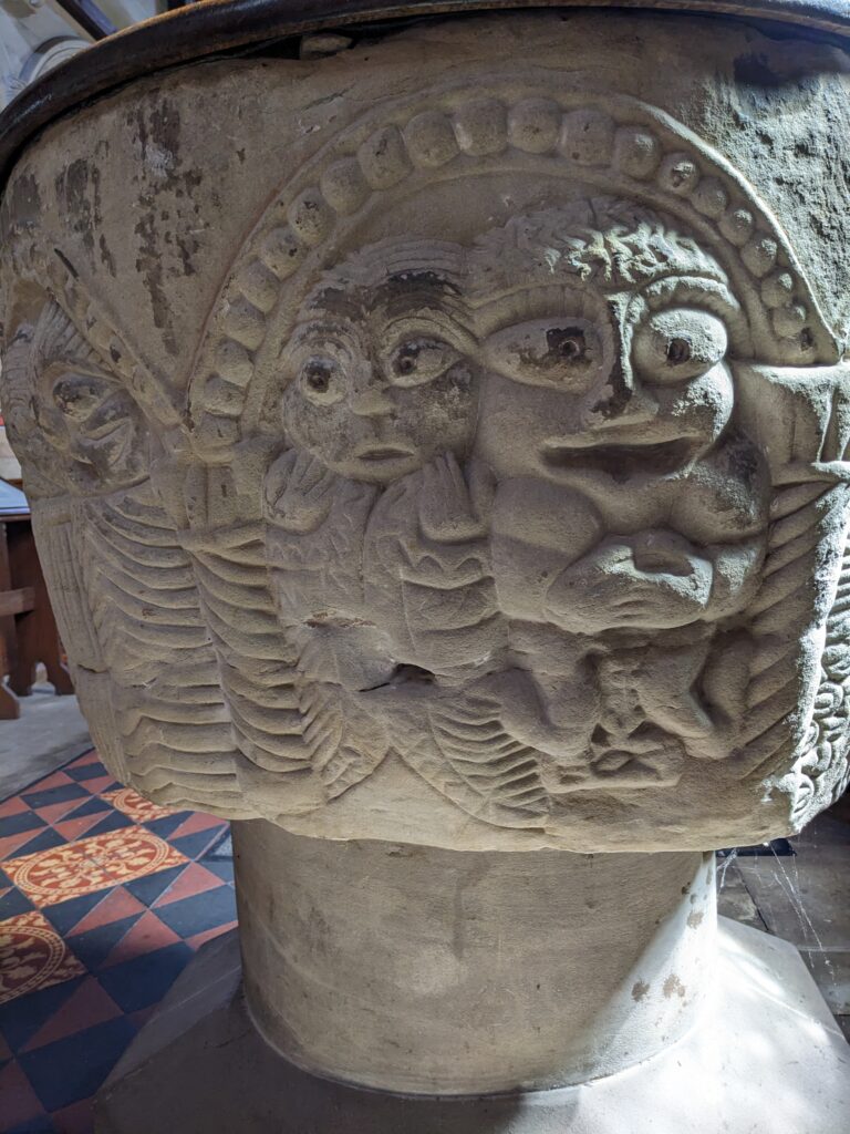
Panel 5 (above) is noticeably different from the previous panels, not only for the increased dimensions caused by the uneven shape of the font. Both figures represent laymen and are bareheaded. The first figure is relatively plain but the second figure is grotesque with a gigantic head, enormous shoulders, very prominent eyes and a different type of mouth. It depicts an Anglo-Saxon and deliberately shows him as separate and a figure of ridicule – even down to him being clean-shaven given that William the Conqueror specifically ruled that Anglo-Saxons must follow Norman style and shave off their prized moustaches.
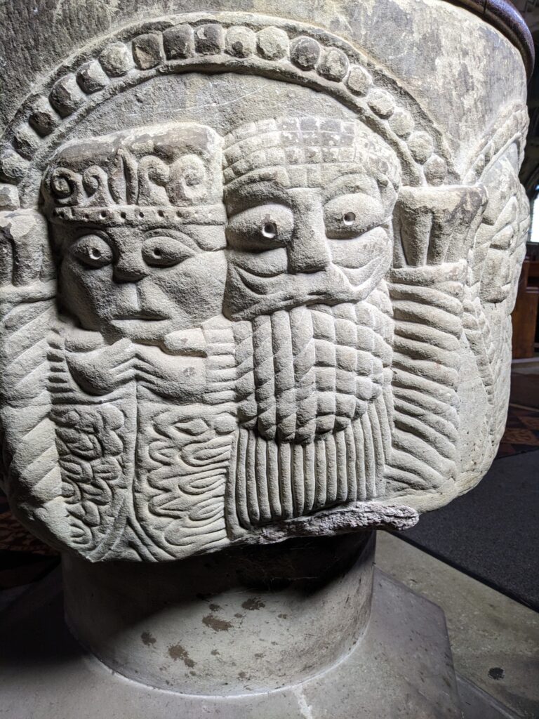
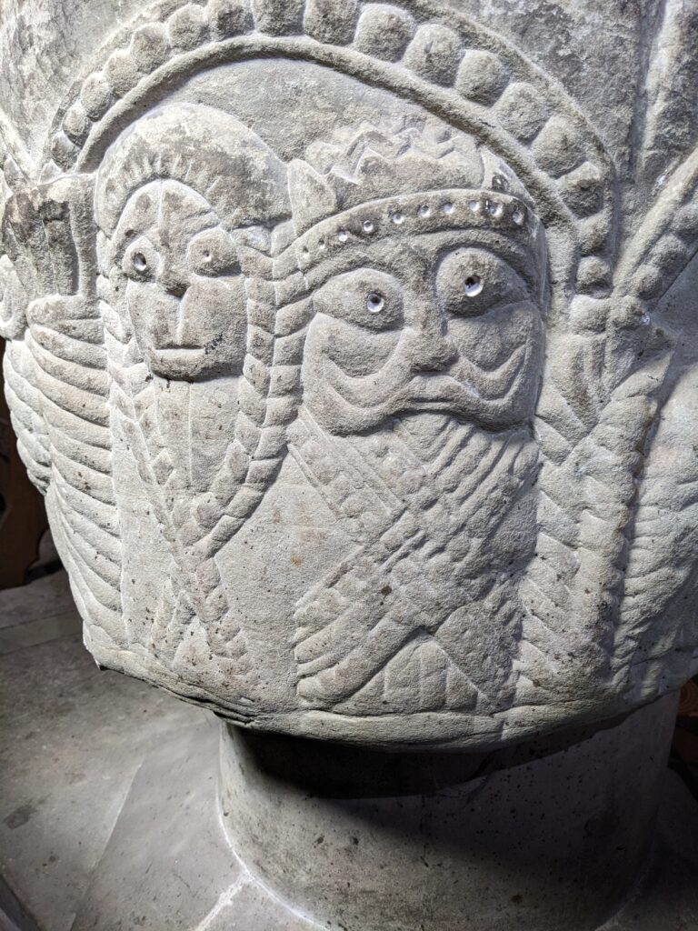
This panel is wider again as the mason struggled to accommodate the stone dimensions. On the left is a clean-shaven man, wearing a crown and dressed in a rich robe. He clearly represents royalty whilst the second figure is believed to represent a courtier.
This final panel again shows the problem with the stone dimensions with the pillar between panel 7 and panel 1 being badly joined. Perhaps it also shows that the mason wasn’t as skilled as he needed to be and it showed a lack of planning? The first figure is the only female on the panels and she is dressed in a hooded garment which crosses over her body and covers her feet. The second figure is richly attired and perhaps this panel represents a prince and princess or maybe a noble and his wife – the Lord of the Manor?
So the panels seem to show
- A cleric and an apostle
- Two bishops
- Two lesser clergy
- Two prophets
- Two laymen including a grotesque Anglo-Saxon
- Royalty and a courtier
- Lord of the Manor and his wife
What story did this imagery portray? Apart from the obvious portrayals of various levels of clergy who would dominate the life of the villagers it seems to me to show that the Normans are in charge and the Anglo-Saxons have been conquered. Early Norman propaganda?
Your interpretation may well be different – if so, please leave a comment below.